Main
Task
To develop an easy-to-use site for selling tickets for standard events, as well as selling live trivia in the format of a corporate event to large companies in Ukraine.
Prototypes
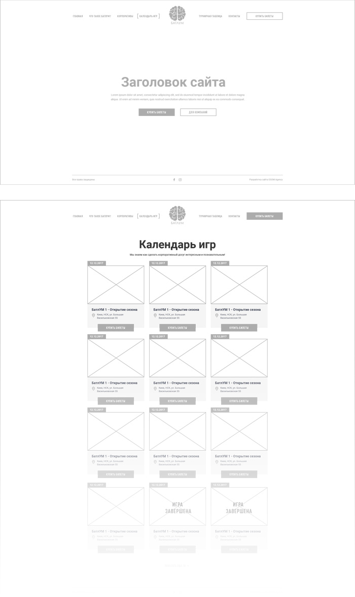
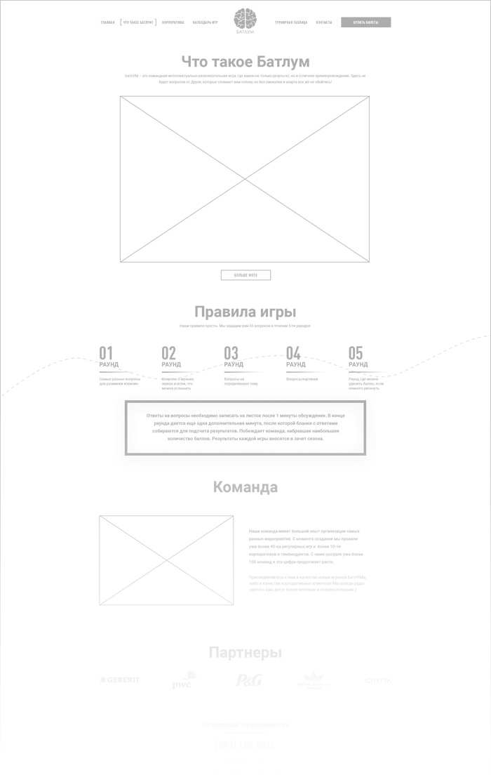
At this stage, we thought over the structure of the pages and placement of the elements.
Design
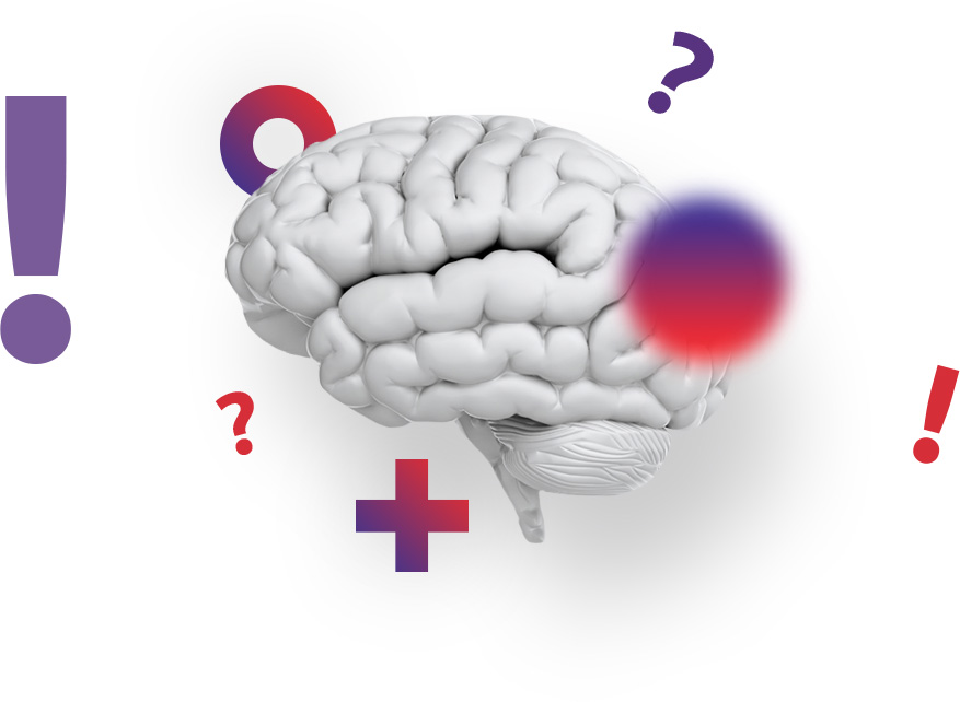
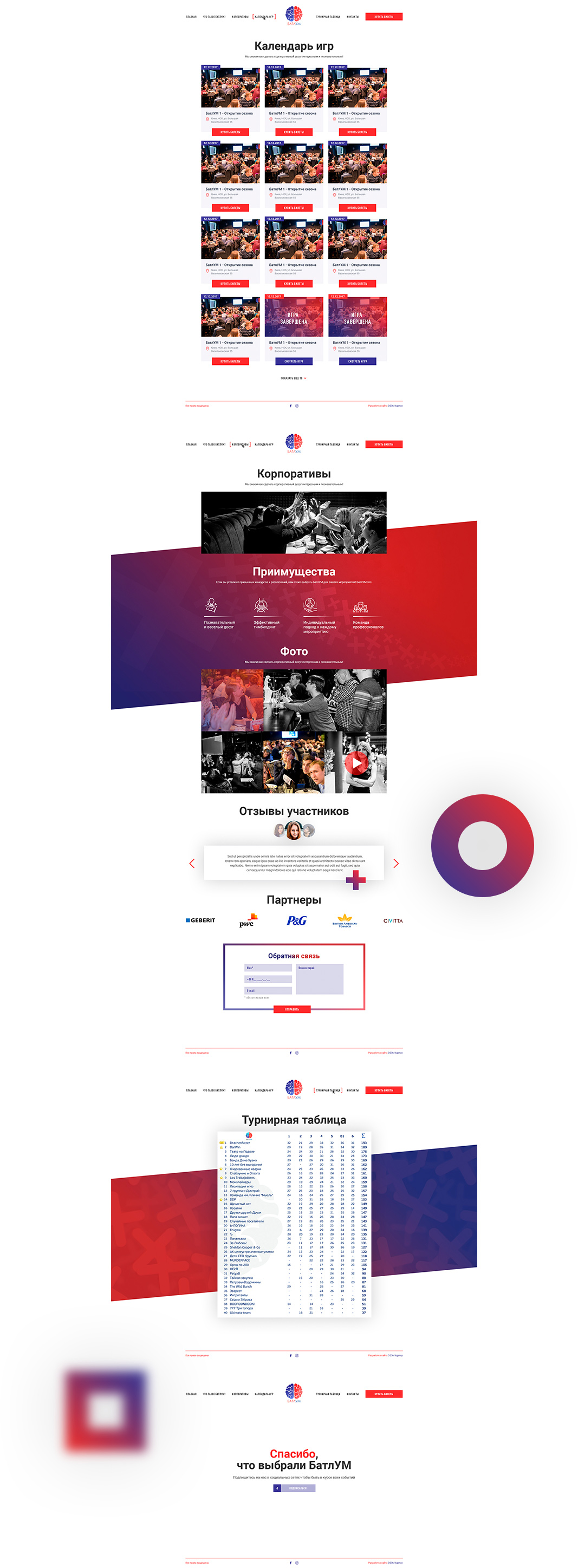
We decided to combine two logo colours and mix them into a trend gradient of two absolutely opposite tones. A variety of additional elements like pluses, X`s and strips emphasize the idea of intellectuality.

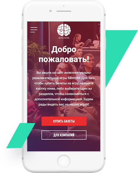
We think mobile
Many users buy tickets literally on the way to the event, so it was very important to make an adaptive site version in a way where users could quickly find the closest event date and buy the necessary amount of tickets for the whole team.
