Main
Task
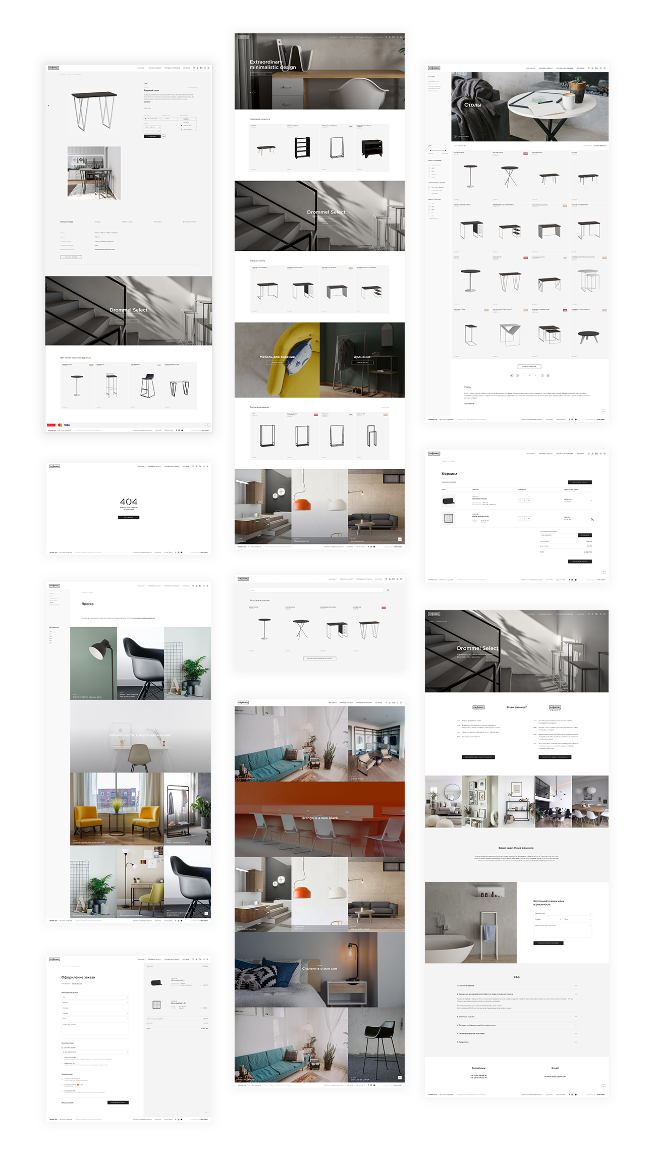
To transfer the site to the new Opencart platform, with a new airy design, having worked through a convenient UI / UX for an intuitive understanding of the site and ease of studying the characteristics of products, which allows to increase conversion and sales.
In addition, we had to think through many integrations with the Customer’s software and the CRM system.

Solution
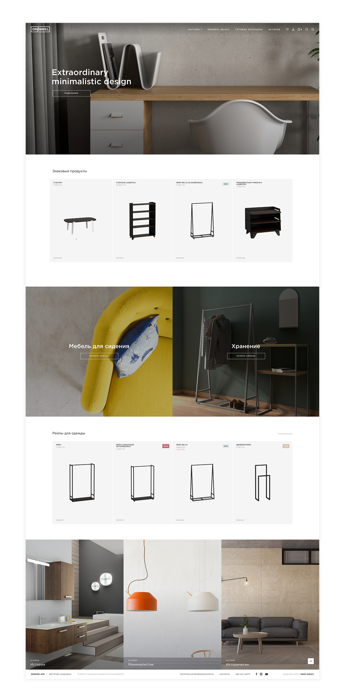
Having inspired by Hygge (a sense of coziness and comfortable communication in the Scandinavian countries), we decided to create a website with large elements and plenty of free space, that helps to focus on the most important thing - goods.Since the store offers many different options for each product, using a specific module we made it possible to change the image and price of the product in accordance with the individual choice of the client. At the same time, the function of choosing the parameters of the product itself was carefully designed by our team in terms of UI / UX.

Design
The site design totally corresponds with the store’s awesomness: it is designed in a minimalistic style, because Drommel is beauty in simplicity without any frills.
Pastel brand colors of the store, combined with thin lines of fonts and details, represent the images of goods on their background in a good way. And large and colorful banners with interiors by Drommel only increase the desire to add more products to the basket.

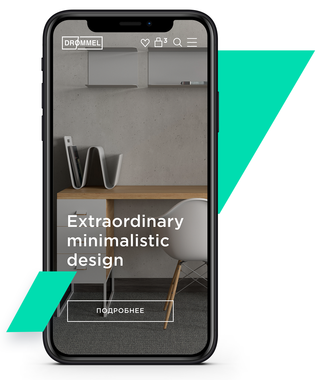
We think mobile
The adaptive version of the website of online store Drommel makes the furniture selection process convenient from any device.
