Main
Task
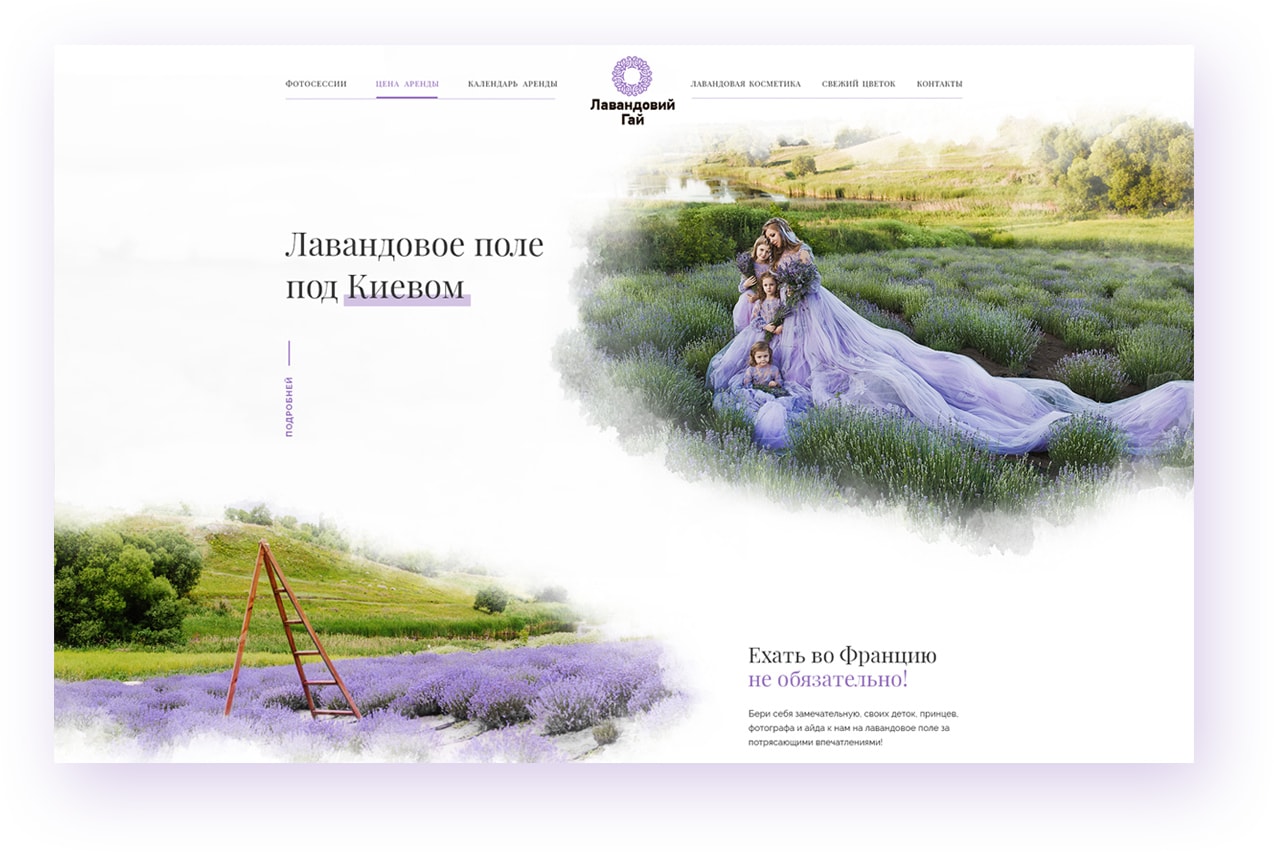
Our task was to create a landing page designed in the Provence style. The target audience of the site are girls who are crazy about beautiful photos, and professional photographers who are happy to take those photos. To help them achieve their goals our team added necessary elements such as a colourful photo gallery, a calendar and a booking form for making reservations.

Solution
Our designers used professional photos edited in the watercolour technique. Great copy, excellent visual side and easy-to-use functionality - website visitors diving into the atmosphere of Provence and simply cannot leave without leaving an inquiry for a photoshoot!
Дизайн
The main difficulty was to combine functional web design with decorative elements. As a result, the site turned out to be not only informative but also memorable. We consider Lavender Field as one of our most beautiful works. Do you agree?

We think mobile
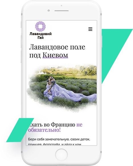
We have thoroughly worked out each detail of the mobile design in order not to lose any images and key messages. Each block and element was tested by our team before launch.
